
10 Key Questions for Great Packaging Design
- Paradise Design

- Sep 12, 2022
- 11 min read
Updated: Nov 21, 2023


First impressions count, especially when you want to catch someone’s attention and persuade them to try your product. How important is packaging design to shoppers? An Ipsos survey found that 72% of Americans polled said the packaging design influences whether they will buy a product.
Packaging design plays a big role in the first moment of truth (FMOT) when a person encounters your product and considers buying it. The special shell that wraps your product is a key element in attracting shoppers to buy so it’s of paramount importance to design it well.
To get packaging design right, much thought and creativity must go into the design process. Many important questions need to be considered. How can you create a great packaging design? Is the one you have working?
The following 10 questions can help you evaluate your current packaging design and create an outstanding new design for your item.
1. Does it express your brand identity?

Your packaging design should express the spirit of your brand. What makes your brand different and better than the others? What values and qualities do you want to showcase to customers as they peruse the shelves?
Nivea prides itself in selling a sunscreen that is reef friendly – their products are free from chemicals that are found in many other sunscreens that bleach and harm the ocean’s reefs. On their website, they share why it’s important to protect coral reefs as they are a key part of the marine ecosystem and generate half of the Earth's oxygen.
That’s why “ocean friendly” is the essence of their brand spirit and a key element in the concept for their packaging design. The phrase is at the top of their sunscreen package (in Chinese above). The sunscreen is also placed next to healthy coral to show the friendly relationship between Nivea sunscreens and the ocean.
The care they take to make their sunscreens nature-friendly enhances the value of their products and brand, and this is reflected well in their packaging. Their brand spirit is particularly attractive to those who care about the environment, which many consumers do.
What is the essence of your brand spirit? That should be a key inspiration for the creative concept of your packaging design.

Vidal Sassoon displays its brand spirit on its packaging design through a symbol and image: a pair of scissors and a bob cut. They’re a reminder of how Vidal Sassoon changed the world and launched his unforgettable name with a blunt cut bob. The revolutionary hairstyle coincided with the second wave of feminism and is an empowering image for women and the brand. A pair of scissors also acts as a symbol of the brand’s trendsetting spirit.
What story do you want to tell the world on your packaging design? The images, symbols, and colors on your package should reflect your brand’s values and personality. For Vidal Sassoon, the scissors, the bob, and vibrant red all express the bold spirit of the fashionable brand.
Is there an emblem or slogan that conveys your brand’s story? How can color reflect your brand’s spirit? These elements can be used to create a great packaging design that reflects the soul of your brand.
2.What shape suits the essence of the product?
The essence of the product itself is also a primary factor in creating good packaging design. The product’s container should suit its identity. What does the product do? What is its texture? How is it best used? What is the optimal way to store it? The answers to these basic questions can aid in creating the perfect container to hold your product.
The shape of the container should highlight what the item is and how it will be used. It should also enhance user experience.

This distinct array of hair care products showcases different products whose shapes reflect their essence - what the product is and does.
The two products on the left are shampoo and conditioner contained in bottle pumps, which are popular vessels for these products due to their ease of use. The shape intuitively lets shoppers know what the products are and the shades in color cue them on their differences.
The item in the middle is a bit more intriguing. The container looks like one used for body butter or moisturizer. Now what is it doing in this showcase of hair care items?

The product is indeed a cream - an intensive hair mask that can be used after the usual shampoo and conditioning routine. This unique packaging for a hair product highlights its value and the time and care needed to apply it.
The user twists off the cap and sets it down. Then, just as in applying facial moisturizer, one dips one’s fingers into the cream and carefully applies it throughout the hair, focusing especially on problem areas such as the tips. The special shape of this hair mask container showcases the uniqueness of this product.

The sleek spray bottles on the right are a motion hold spray that’s used to add body and make hair easier to style. The stylish shape of the bottles highlights its role as a fine hair styling product.
The three different shapes of the containers show what the products are. They also fit their function and convey their value.
What type of container would highlight the essence of your product? What shape would make it easier to use and store? These are important first questions to consider when creating a packaging design. Form follows function while a stylish shape contributes to attractive packaging design.
3. Does it stand out on the shelf?

Which brand of beer catches your eye? A Mobile Eye-Tracking study by Perception Research Services International found that most customers don’t even see two-thirds of the products on a shelf. That’s because on average a shopper spends only 1.9 seconds at the shelf.
What products do customers usually notice? The study found they are likely to default to a brand they’ve used before. That makes it especially challenging for new brands to gain new market share.
How can your packaging design grab a customer’s attention? First, look at competing products on the shelf to make sure your design stands out.
Keep your packaging design simple. Make it distinct, and don’t be afraid to be different. For example, if all the other brands use dark bottles, use a light or transparent one. If other brands use plain dark labels, use a fluorescent one or change the way the label wraps the bottle altogether.
Choose colors, fonts, prints, and material that scream at the customer, in your particular style. The use of vibrant colors will make your brand pop in a sea of similar items. A unique icon or image can also make your product intriguing. Does your product provide a special benefit or contain a precious ingredient? Is there a brand spirit that must be showcased? Show that on your packaging design.
When you’ve created sample designs, place them next to the competition to see if your packaging design is eye-catching.
4. Who are you designing it for?
As you create your packaging design, it’s also important to know your target customers. First, identify your potential buyers. Are they female or male? What age group and income bracket are they in? What is on the minds of people in that group? What do they want out of life? What are their needs, struggles and desires? What would they want from your product?
Once you better understand their psyche, think of a message that would appeal to them. What colors and style elements would attract them? Keep these questions in mind to create a design that allures them on a visual and emotional level.

This “Miracles” hair care package is clearly designed for women as it uses light pink and ribbons on its box to make a feminine gift. It also has a message that’s inspiring to modern women.
Their slogan “I create my Miracles” is an empowering and intriguing thought. It might just get female customers to stop and think a moment about it. The slogan tells women to be proactive in creating great experiences for themselves. This assertive approach to self-care appeals to women on an emotional level as it embodies a spirit of confidence that most female customers would love to embrace.
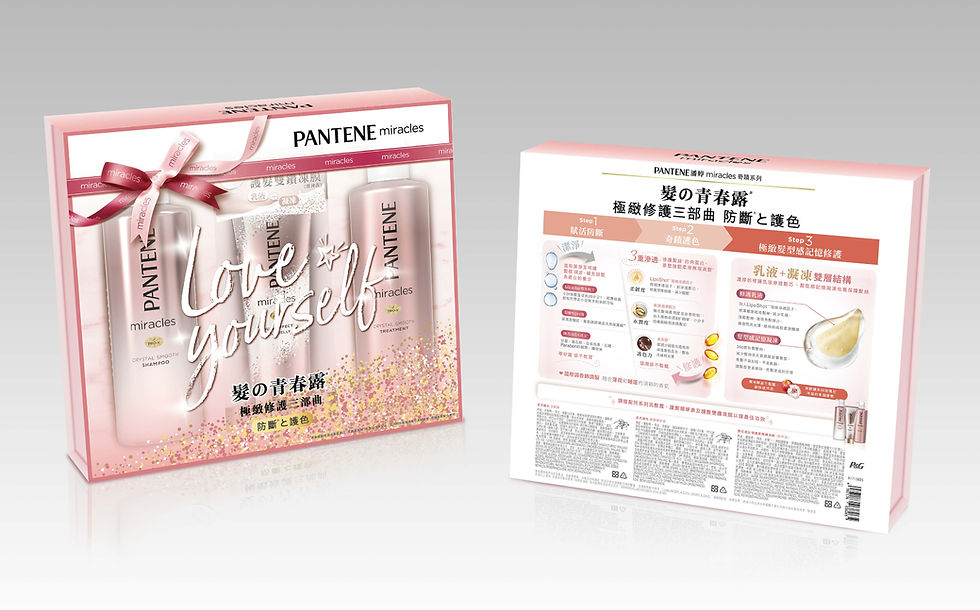
The message on this package “Love yourself” is also simple yet powerful. As female shoppers roam the aisles, the slogan could entice a shopper to be good to herself by buying this pack.
Information explaining the product is also an important part of the packaging design. The back of the packaging explains via images why the series is called a miracle - the products contain both conditioner and conditioning oil that act as an in-depth home treatment for one’s hair.
The lovely gift packaging design encourages women to pamper oneself or to buy the set for a friend. The message, colors and design are bold and attention-grabbing. They speak to the hearts and minds of women today. Who do you want to allure with your product? What type of message and design would appeal to them?
Conducting focus groups on your target customers is a good way to understand what messages and designs would resonate with them. The more you know the needs and tastes of your shoppers, the better you can create a marketing campaign and packaging designs for them.
5. Can it be presented as a gift?
The packaging design is even more important if the product might be used as a gift. An Ipsos survey found that 81% of Americans polled said the packaging design influences whether they will buy an item for a gift. Beautiful packaging adds much value for the gift buyer and could be the deciding factor in a purchase.

This L’Oreal Age Perfect skincare series is for mature women who want to care for their skin. The aesthetic of the packaging design is both classy and classic and would appeal to women of this age demographic.
The elegant gold gift box makes it look like a luxurious gift. The layers of gold light visually enhance the value of the product while the black belt offers a contrasting background to highlight the radiant gold flower and product description.

A gold and black color scheme also exudes elegance for this Godiva gift box. The classic colors accentuate the value of this expensive gourmet brand of chocolate.
A shopper looking for a gift would easily be attracted to this packaging design because it adds prestige to the present. There’s also the added plus of not having to do additional gift wrapping. The buyer can present her friend with this graceful gift just as it is because the box is so beautifully designed.

This Vidal Sassoon gift box series was a limited series designed for Women’s Day. The gift boxes were created to encourage women to be themselves and to not be afraid to be different. Thus, women with distinct looks and styles are featured on the covers.
The client also wanted the style of the packaging design to embody a Vidal Sassoon fashion sensibility. The illustrations of these confident women are unique. They not only show off great hairstyles, which are a key image for the brand, the cover ladies also express a spirit of personal confidence that appeals to many modern women.
Is your packaging design attractive enough to make it a perfect gift?
6. Are there special ingredients to highlight?

The Japanese brand Hair Recipe is known for its organic hair solutions and unique ingredients. The ingredients displayed above - honey, apricot, apple, ginger - are an integral part of the packaging design and what make the product distinct. There aren’t too many other brands filling their shampoo with nourishing fruit and that’s what the brand highlights on their designs.
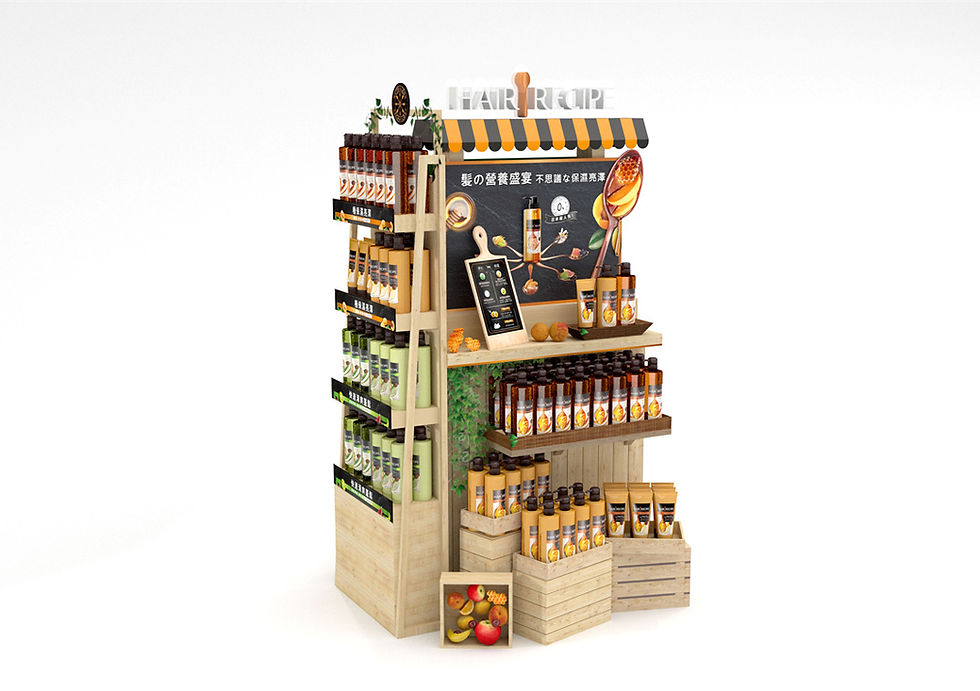
The images of these antioxidant-rich fruits are what make the packaging design unique in a sea of hair care items. This theme is a key mark of its brand identity and can be seen in everything from its product name to images of the fruit and colors of the containers. The superfood images and colors complement each other to form a refreshing aesthetic and unique brand essence.
7. Is it memorable?

People usually don’t associate feminine hygiene products with outer space, but Kotex does. The brand promoted a revolutionary new “stellar space pad” sanitary napkin that is only 0.8 mm thin. It has a “rocket-shaped” design that is slimmer up front and that “moves with you.”
The space metaphor for lightness is a plus for women who want to wear light and comfortable feminine products, and for any girl who has dreamed of becoming an astronaut, it has special appeal.
A memorable metaphor, image or slogan are great ways to draw attention to your product.

This Shiseido PR box uses colors that convey a sense of elegance and complement the colors of their products. The beautiful fans highlight the Japanese identity of the brand and evokes an image of femininity and self-care. This elegant Asian-themed packaging design makes this gift set memorable and enhances its brand image.

The successful design of this special gift set exudes an air of elegance that influencers are delighted to associate themselves with.
8. Is it attractive?

The packaging design for this Herbal Essences bio renew series is an outstanding example as it combines many of the elements suggested in this article. The design places the products amidst images of the United Kingdom’s Royal Botanical Gardens, Kew where it sources rare organic ingredients for its hair products.
Herbal Essences proudly claims the Royal Botanic Gardens, Kew’s scientists as their partners in identifying botanicals for their plant-powered shampoos and conditioners. The packaging design highlights this one-of-a-kind source of their ingredients which is a key aspect of their brand identity.
The transparent windows are designed like the glass houses where botanicals are kept in the royal garden. They provide a lovely frame to showcase the hair care series. The colors of the flowers and leaves complement the purple and green products beautifully. This gorgeous packaging is attractive enough to be used as a gift box and is a perfect showcase of the essence of their brand.

Representatives of Vidal Sassoon asked Paradise Design to design a box that has the “feeling of spring.” This lovely box with their trademark logo front and center was created with that spirit in mind. The beautiful flowers on the cover make it a delightful gift to oneself or others.
For Vidal Sassoon, the design is also innovative. It showcases their iconic red and white logo in the center and in white in 3D, while it also radiates the beauty of spring. It presents this bold iconic brand in a gentle feminine light. This creative design adds a new softer dimension to Vidal Sassoon’s brand image.
The box is so beautiful it would easily be bought for a gift for a friend or for oneself. Attractive packaging like this box also adds value to the customer because they are likely to be reused and repurposed.
9. Does it enhance user experience?

In addition to aesthetics and brand identity, practical considerations in a packaging design are also important for the user experience.
How will the product be carried? Is it a good size for a person to transport and store? Packaging design needs to cater to the ways the customer will transport, open, use and store the item. This gift box above has handy handles that make it easy to carry.

Dayungs is a fruit drink shop known for its fresh high-quality fruit that’s delivered daily to its stores. Large images of fruit are a mark of their brand identity and packaging design.

Green is also an integral part of Dayung’s brand identity. It represents the Earth and is a main theme in their packaging and logo. The vibrant portraits of fresh strawberries on the box above are also great as they show people the luscious fruit they can enjoy when they open the box.
The boxes are also easy to transport, use and recycle. They are made of cardboard and designed to be easily opened, flattened and recycled.
10. Is it eco-friendly?
This brings us to an important new trend – packaging that is eco-friendly.
A recent Ipsos survey found that 71% of Americans say they would more likely buy brands that use paper or cardboard in their packaging. 88% said this is because paper is easier to recycle while 81% said it’s because it’s more in line with today’s expectations.
People want to live in a healthier more sustainable world. Eco-friendly elements in one’s packaging are thus a plus with customers.

The Ipsos study showed 63% surveyed would buy a product packaged with paper or cardboard because the packaging is reusable.


When a brand has eco-friendly elements, it can highlight and explain them on its packaging. Herbal Essences highlights that it is FSC certified which means the package is made from paper that has been sourced in a responsible manner. Its bottles are also BPA-free. Bisphenol A is an industrial chemical that has been used to make certain plastics and resins. Some research has shown that BPA can seep into food or beverages and this exposure could bring negative health effects. When your brand takes the care to be good to the environment, these benefits should be highlighted for customers to see.
The ten questions above are a good place to start to create an outstanding packaging design for your product. The designs highlighted in this article were created by Paradise Design, a top design firm in Taiwan. Paradise Design is available to work with clients around the world and can help you create designs that enhance your brand’s identity and meet marketing goals.
Paradise Design also offers free marketing consultations for new clients. Please feel free to visit the Paradise Design website at en.paradise-design.com.tw and contact natalie (at) paradise-design.com.tw to discuss your design needs.


Packaging design that answers the right questions before production starts saves brands from expensive redesigns that always seem to happen after the first batch has already shipped. The question about shelf differentiation is the one most brands skip because they design in isolation without considering what their product will actually sit next to in a store. Functionality versus aesthetics is another tension that only gets resolved when someone asks the hard questions early in the process. At our custom web development company USA we apply the same questioning framework before starting any project because assumptions left unchallenged at the beginning always become problems at the end. Whether it is packaging or a website the quality of the questions you ask…
I love how clearly you break down the essentials of great packaging design—your insights make the process feel practical and achievable. It’s as satisfying as finding reliable velcro patches near me to add the perfect custom touch to any project.
Great insights! These “10 Key Questions for Great Packaging Design” really highlight how smart planning can shape a product’s success. Clear messaging, strong visuals, and customer-focused design make all the difference. If anyone is working on improving their brand identity, getting professional stationery design help can also enhance overall consistency and make your packaging look even more refined and trustworthy.
This article brilliantly explains how thoughtful packaging design shapes brand identity and customer perception. Every detail, from color to structure, tells a story. Even custom shipping boxes can reflect these principles, turning ordinary packaging into a meaningful brand experience that delights customers and strengthens recognition from the very first glance.
Okay, so I have my small thesis binding Canada and just recently did a complete done-the-road rebranding for it, and this article has actually touched me. The questions on packaging design made me rethink how I have my products present themselves to students. For instance, I just realized the meaning and feel of the cover would have to speak of professionalism and trust, not durability alone. It is true- first impressions count. The shape, the material, the color, now all these show how careful we are with each thesis. Good read, indeed!